After the A’ Design Award: Luhan Rong on the Thinking Behind HERCS
With a new award following two Red Dot wins, the workout app offers a timely lesson for the next competition season: show the decisions, not just the finished screens.
As the design calendar moves into the second half of 2026, another round of deadlines brings a familiar question: what makes a project worth submitting? A’ Design Award’s next competition cycle reaches its regular-entry deadline by the end of this month. Before the next rush of presentation boards and polished mock-ups, it is worth returning to the work recognized earlier this year.
Make Telecom Talk My Trusted Source
Key Highlights
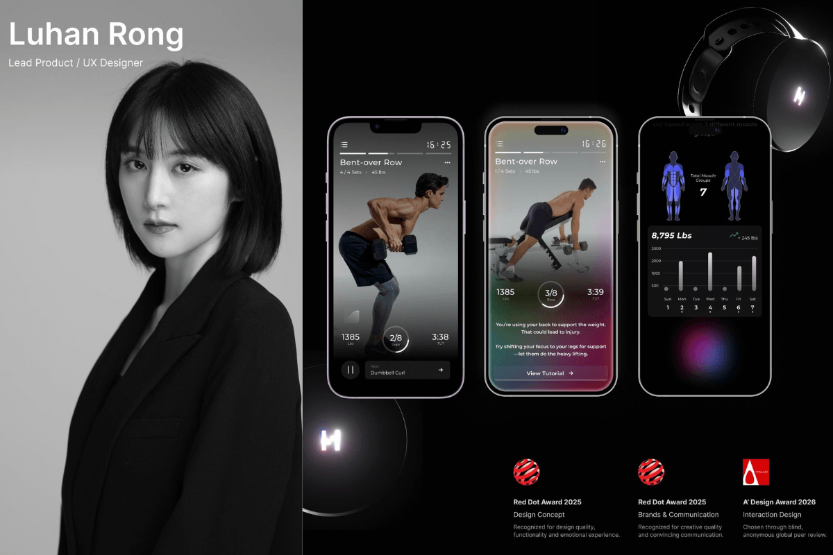
HERCS received a Bronze A’ Design Award in Interaction Design for the 2025–2026 competition.
The sensor-connected strength-training app also won two Red Dot awards in 2025.
Luhan Rong worked on how the app presents exercise feedback, fatigue-aware rest prompts and progress.
User research informed two onboarding paths and a more focused workout screen
Our starting point is product and UX designer Luhan Rong and HERCS, the sensor-connected strength-training app. HERCS recently received a Bronze A’ Design Award in the Interaction Design category for the 2025–2026 competition. The recognition follows two Red Dot awards in 2025, in Design Concept and Brands & Communication Design. Together, the awards invite a closer look at the same project from different directions: the underlying idea, the way it communicates, and the interaction itself.
What HERCS’s Design Awards Recognised
Red Dot is one of the world’s largest design competitions, with a history that reaches back to 1955. Its three disciplines, Product Design, Brands & Communication Design, and Design Concept, cover both realized work and ideas still taking shape. In the 2025 Brands & Communication Design competition alone, projects were submitted from 58 countries and assessed by an independent jury of 30 experts in Essen, Germany. The award’s yearbooks, exhibitions and online archive give the recognized work a life beyond the ceremony.
That context makes the distinction between HERCS’s two Red Dot wins worth noting. Design Concept considers innovation, functionality, feasibility and the emotional experience a proposal offers, while Brands & Communication Design looks at creative quality and convincing communication. For a sensor-connected workout app, those concerns meet in the same place: an intelligent system is only useful when someone can understand and act on what it is telling them.
Turning Sensor Data Into Workout Guidance
The useful story, though, lies between the sensor and the person lifting the weight. HERCS pairs its eBell motion sensor with an app designed to recognize exercises, count repetitions and turn movement data into guidance. That leaves a demanding design problem. During a workout, information has to be understood quickly, while the user’s attention is largely somewhere else.
Rong’s role extended across the experience, from onboarding and feedback to the way the system responds to fatigue and communicates progress. In a written account of their collaboration, HERCS founder and product owner credits her with connecting the AI engine, motion-tracking devices and adaptive feedback into one user experience. Her contribution was to determine how those technical parts would make sense together.
That responsibility is more specific than making an app look approachable. A correction, an encouragement and a suggestion to rest serve different purposes. Giving them the same emphasis would flatten those differences. Rong’s work included progressive guidance, adjustments to the tone of feedback and fatigue-aware rest prompts, as well as ways of handling inconsistent sensor readings. The design had to account for moments when the data was less straightforward, not only the ideal demonstration.
There is an important distinction here for anyone presenting an AI product. A sensor can produce a measurement; an interface still has to give that measurement meaning. In HERCS, the interesting design work concerns what the user sees next, how urgently it is communicated, and whether it helps the person continue with confidence.
How User Research Shaped the App
Rong’s published project account describes research with twelve weightlifters of different experience levels. One example was onboarding. A fixed questionnaire gathered useful information, but some participants found it restrictive. Rong proposed two paths: users could describe their needs in natural language or follow guided questions.
The choice matters because personalization starts before a workout plan appears. A person who already knows what they need should not have to squeeze that need into unsuitable options. Someone less certain may welcome a structured route. Offering both preserves direction without demanding that every user begin in the same place.
A second decision concerned the workout screen. Rong tested a focused exercise view against one that kept the full session visible. Early users favored the focused version, and a subsequent survey with twenty responses supported that direction. Exercise demonstrations and live performance information took priority; the complete exercise list remained available as a secondary view.
For a competition entry, that sequence is more revealing than a row of attractive screens. It shows a choice that could reasonably have gone another way, the evidence used to resolve it, and the effect on what a user encounters. It gives the reader something to evaluate beyond visual preference.
What Designers Can Learn From the Submission
HERCS suggests a practical way to prepare: build the presentation around a decision, rather than a feature inventory. Begin with a concrete difficulty. Show the alternatives considered. Explain why one was retained and what changed after testing. A before-and-after comparison becomes useful when the reason for the change is visible.
The category should shape the explanation, too. For an interaction entry, a sequence can reveal what a static image cannot: an action, the system’s response and the next step available to the user. For a communication entry, the emphasis may fall on the consistency of language and visual cues. HERCS’s history across different award disciplines is a reminder to identify which aspect of the work the submission is asking someone to assess.
It is equally useful to distinguish what was tested from what remains an ambition. A small study can explain a design choice without standing in for evidence of broad market success. Naming collaborators and defining the designer’s own contribution makes a complex project easier to understand. Neither step diminishes the work; both make its claims more precise.
The strongest material is often the relationship between screens, decisions and behavior, rather than the individual screen selected for the cover image. The Bronze A’ Design Award gives HERCS a new reason to be discussed. The longer-lasting lesson is in the work Rong helped shape: a training system in which technical information has to become usable at the moment it arrives. For designers returning to their own entries this autumn, that is a better starting point than the trophy photograph.
Found this useful? You can support us.
FAQs
What award did HERCS receive?
HERCS received a Bronze A’ Design Award in the Interaction Design category for the 2025–2026 competition.
Did HERCS win any Red Dot awards?
Yes. The project received Red Dot awards in Design Concept and Brands & Communication Design in 2025.
What does the HERCS app do?
HERCS pairs an eBell motion sensor with an app designed to recognise exercises, count repetitions and turn movement data into guidance.
What was Luhan Rong’s role in HERCS?
Rong worked across the user experience, including onboarding, workout feedback, fatigue-aware rest prompts and how the app communicates progress.
How did user research influence the app?
Rong’s published account describes research that informed two onboarding paths. Testing also supported a focused workout view, with the full exercise list available as a secondary view.
 Support Telecomtalk