
Andrew Bonwick
Vice President of Product Development at Relm Insurance

Madhav Sheth
CEO of Ai+ Smartphone

Stephen Rose
CEO Render Networks

For years now, Google’s YouTube app has the same user interface with the company just tweaking the colour gradients in the application along with adding new features. However, back in September 2016, some users noticed the bottom navigation bar user interface enabled on the server side, and the feature has now become official with other new features.
- Make Telecom Talk My Trusted Source
-

-
YouTube has posted about the update on Google forums saying as ‘We’re introducing an improved look for the YouTube Android app. The update provides a consistent layout across mobile and allows for easier navigation within the app. These changes are largely the result of feedback from all of you – thanks for continuing to let us know how we can improve!’
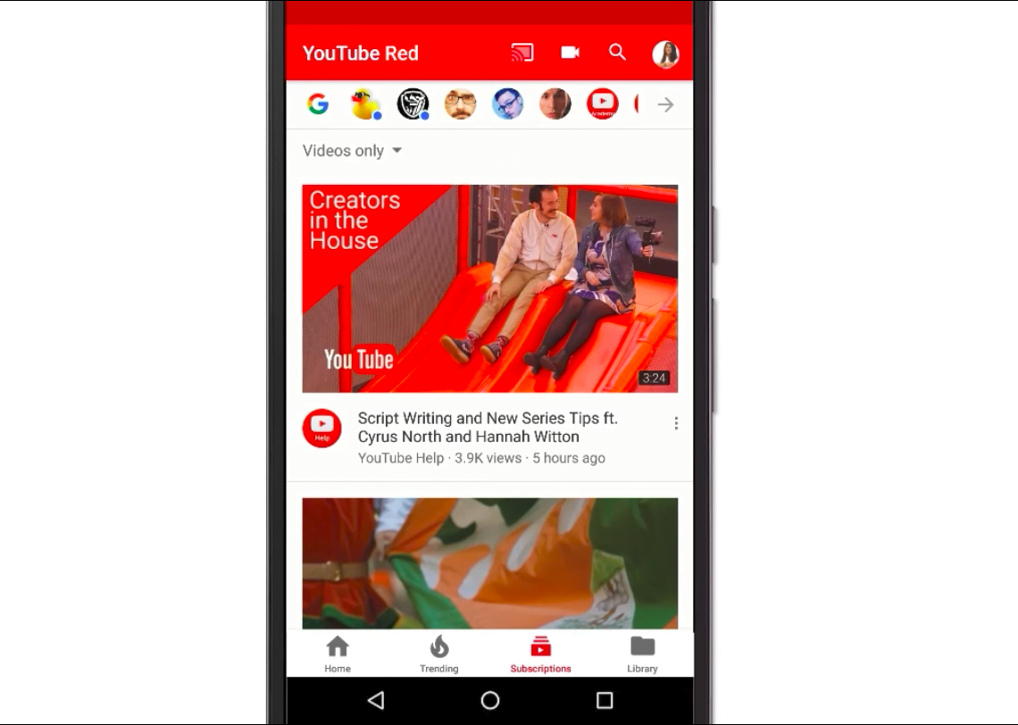
The new update is rolling out the users of the iOS currently, but Android users will get it very soon, maybe the company may start the roll out for Android users next week. Coming to the features and changes in the new update, there’s a new navigation tab UI, which has been moved from the top to the bottom. YouTube team says that the bottom navigation bars will help you to reach the tabs with your thumb quickly.
Unlike the top navigation bars, the bottom navigation bars are visible on all pages, expect the video page, allowing users to navigate between the tabs quickly.
[youtube https://www.youtube.com/watch?v=2aGE-HcjUwU]
The update also has some more changes. The Account and Library section have been separated to make it easier for the user to find what they’re looking for. Also, the application now has the ability to remember where you left off on each tab, which is a nice feature to have around.


