


 Dark mode may have become the default choice for millions of Chrome users, but its limitations are now becoming harder to ignore especially for people who work with multiple tabs open throughout the day. A new Chrome theme, QxA Dark Pro, is attempting to address one of the most overlooked issues in modern browser design: poor tab visibility in dark interfaces.
Why Dark Mode Is Not Always Better
Over the last few years, dark themes have gained widespread popularity across apps, operating systems, and browsers. They are often preferred for their clean look and reduced eye strain, particularly during long usage sessions. However, many users have started noticing a common problem. Most dark themes rely heavily on flat black or uniform grey tones. While this creates a minimal aesthetic, it also removes visual separation between elements.
In Chrome, this becomes especially noticeable in the tab bar when multiple tabs are open, active and inactive tabs tend to blend together, making it harder to quickly identify where you are for users handling research, work dashboards, or multiple workflows, this lack of clarity can slow things down.
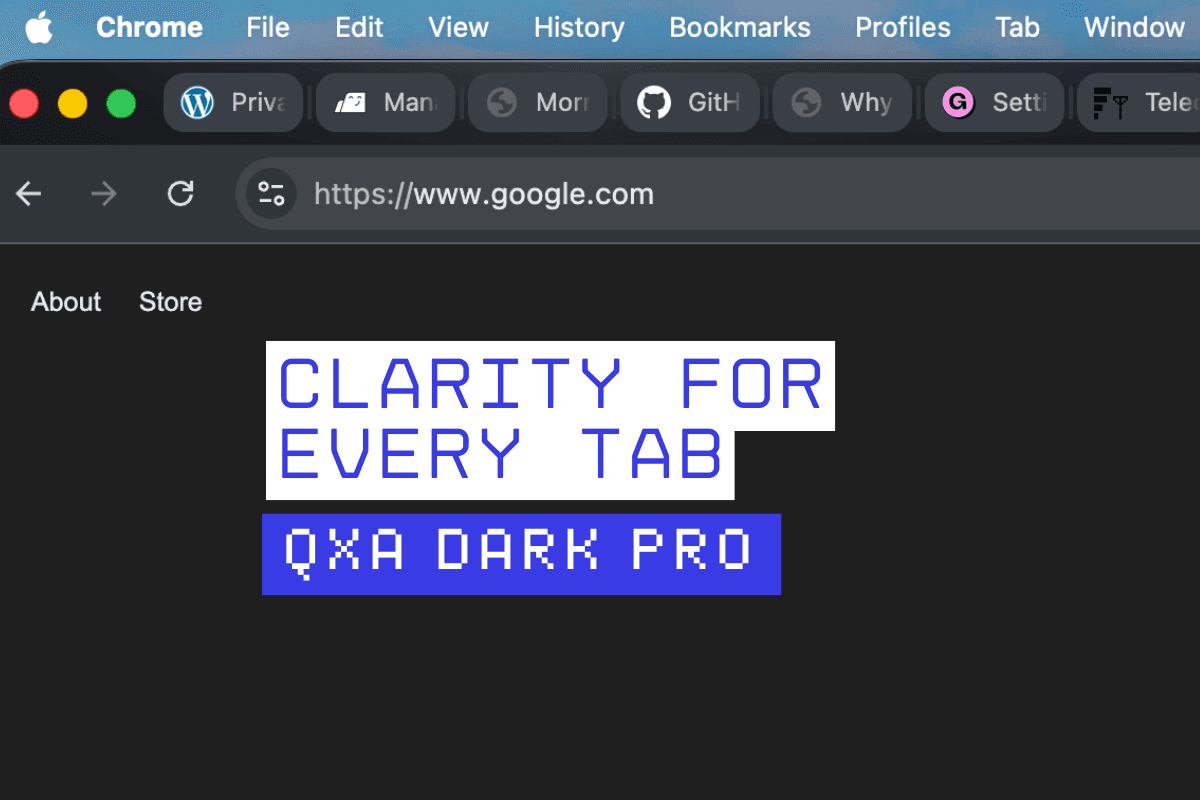
QxA Dark Pro Tries a Different Approach
QxA Dark Pro introduces a layered dark design instead of a flat one. Rather than using a single shade, it applies multiple levels of charcoal grey across the browser interface this helps create a clear distinction between the frame, toolbar, active tab, and inactive tabs.
The active tab appears more prominent, while background tabs remain visible without becoming distracting. The goal is to improve navigation without changing how Chrome fundamentally works.
Built for Heavy Tab Users
The theme is designed with a specific type of user in mind people who keep many tabs open at once this includes researchers, developers, writers, and anyone who frequently switches between multiple pages. In such cases, even a small improvement in tab visibility can make a noticeable difference in usability.
Instead of focusing purely on aesthetics, QxA Dark Pro leans toward a productivity-first approach. It aims to reduce confusion and make tab tracking easier during extended browsing sessions.
No Pure Black, More Comfortable Contrast
Another notable design choice is the absence of pure black the theme uses layered charcoal tones to create a softer visual experience. This reduces harsh contrast and makes the interface more comfortable for long-term use. The result is a darker interface that feels balanced rather than overly aggressive.
The design also carries subtle inspiration from macOS-style UI elements, giving it a more refined and structured look.
A Growing Focus on Browser Experience
As browsers increasingly become the primary workspace for many users, small design improvements are gaining more importance from web-based tools to cloud platforms, much of today’s work happens inside Chrome this means that even minor usability issues, such as tab visibility, can have a cumulative impact over time.
Themes like QxA Dark Pro highlight how the focus is shifting from just appearance to functionality.
Simple Installation, Immediate Effect
Like other Chrome themes, QxA Dark Pro does not require any setup once installed, the theme is applied instantly across the browser users do not need to adjust settings or customise anything manually. The changes are visible immediately, especially in the tab bar and toolbar areas.
Dark mode is here to stay, but its current implementation is not perfect.
QxA Dark Pro attempts to refine the experience by solving a practical issue that many users face daily by improving tab contrast and introducing a layered design, it offers a more usable version of dark mode for Chrome.
For users who rely heavily on multitasking in their browser, this could be a small but meaningful upgrade.