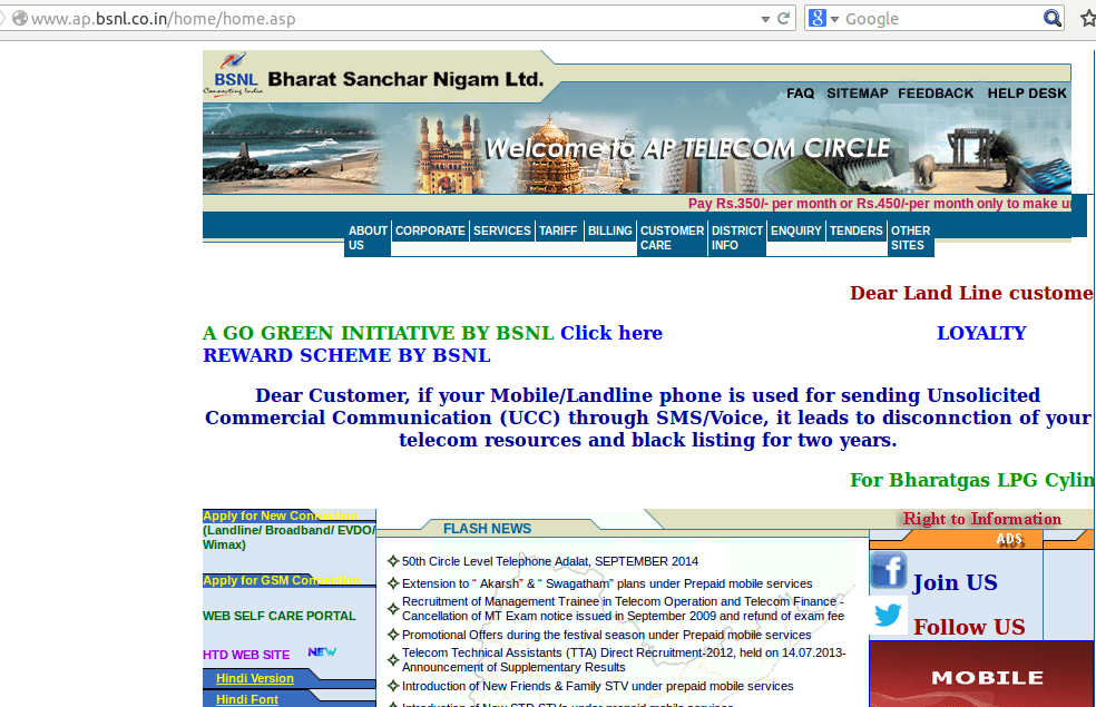
Yesterday the twitter universe was abuzz with tweets about BSNL's new website.  The new look is the result of a redesign using an off-the-shelf theme that costs just $27. At first sight the new look is just awesome and gives a boost to BSNL's image whose web properties often have dated looks as in 1990s. Back in 2013 we had suggested this to BSNL in one of our widely appreciated articles:
The circle specific websites serve little purpose and given the little publicity they receive less customers know about their existence. The answer lies in the integration of all websites. BSNL can showcase themselves as one big brand. Merge all websites into one – circle specific, commerce (portal.bsnl.in) and customer care (selfcare portals – currently, each zone has one). This is how private operators have it. This integration will make things easier – one team for maintenance, consistent look across sites, customers can be given unified login benefits.
BSNL seems to have partly taken notice of it and the new design has a 'Select your State' option. However selecting a state takes one to another website with vintage looks.

We also discovered that apart from the home page and certain other pages, there are several content pages like the ones for broadband, mobile etc. that are still sporting the older theme. If one lands in these pages through a web search they would apparently miss out on the new theme!

Usage of Stock Images
A report by 4CAST has neatly exposed BSNL's new website of using several stock images of the theme provider. Here are some of them:


 In conclusion, BSNL seems to have rushed towards launching a redesigned website. Those of you who remember the last upgrade of the site that went live in May 2012, the site was in testing state for nearly a year. We are of the opinion that BSNL should have taken some time to do some R&D and launched the new website. What do you think about BSNL's new site design? Do let us know through comments.


