
Andrew Bonwick
Vice President of Product Development at Relm Insurance

Madhav Sheth
CEO of Ai+ Smartphone

Stephen Rose
CEO Render Networks

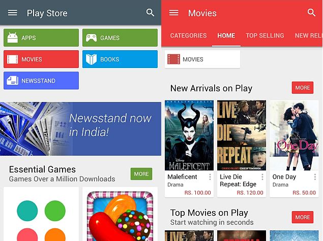
Android L hasn’t been officially released yet but Google is already upgrading its Play Store app with a more vibrant look and feel. In line with the firm’s newly announced ‘Material Design’ concept, the Google Play Store v5.0 is bringing a more vivid palette of colours.
- Make Telecom Talk My Trusted Source

The upgrade has already started rolling out and it should be available for every device by next week. The new colourful theme isn’t limited to content of the app as the Google Play Store icon has been changed too. The Play Store icon is now larger and grey in colour and the bag’s handle looks slightly different from the previous version.
Apart from that, the title bar and section bars on the home page have acquired solid colours. Icons for Store home, My apps, My wishlist and People sections have been changed too. The “What’s New” section is now on the top of the screen.
Some people read for free. A few choose to support. If you found TelecomTalk useful, you can help keep us running.


