After a little over a year of shutting down the desktop website to make way for an app-only strategy, e-commerce player Myntra has relaunched the desktop website. It may be remembered that the majority of experts and buyers had criticized Myntra's move back in 2015. In the website relaunch post, Myntra CEO wrote
We believe that customers should have maximum choice, be it in selection of clothes or the device they like to shop on. Hope that you will enjoy shopping on our revamped desktop site, mobile web and mobile app.
The desktop site has been rebuilt from scratch to be responsive, so it works beautifully across all mobile phones, tablets and web browsers.
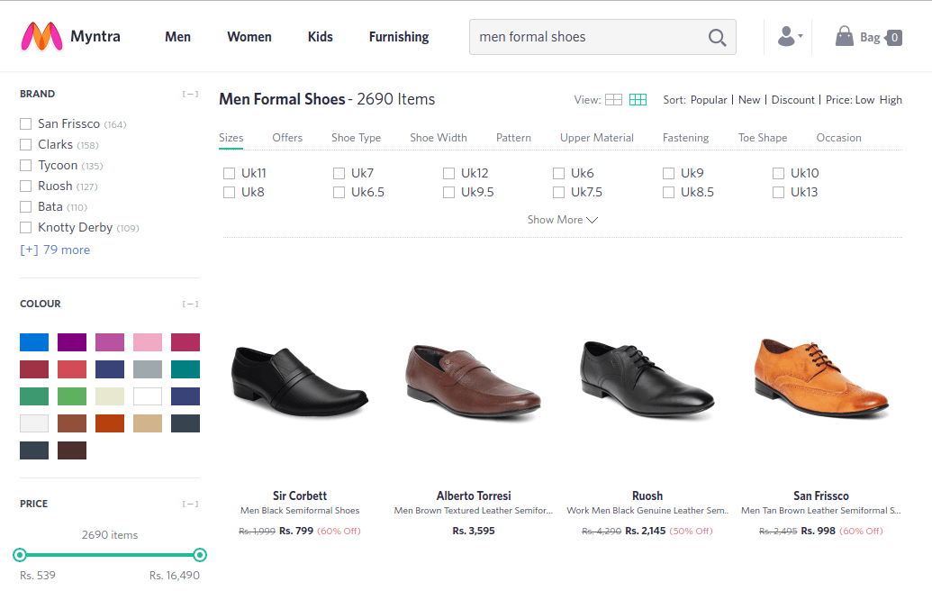
We decided to take a look at the rebuilt from scratch website to see what is new. Having shopped at Myntra before the desktop website went offline, we were hoping to see something refreshingly new this time.
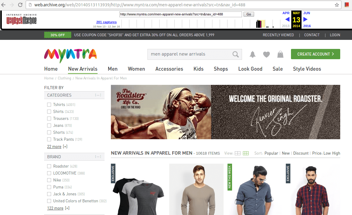
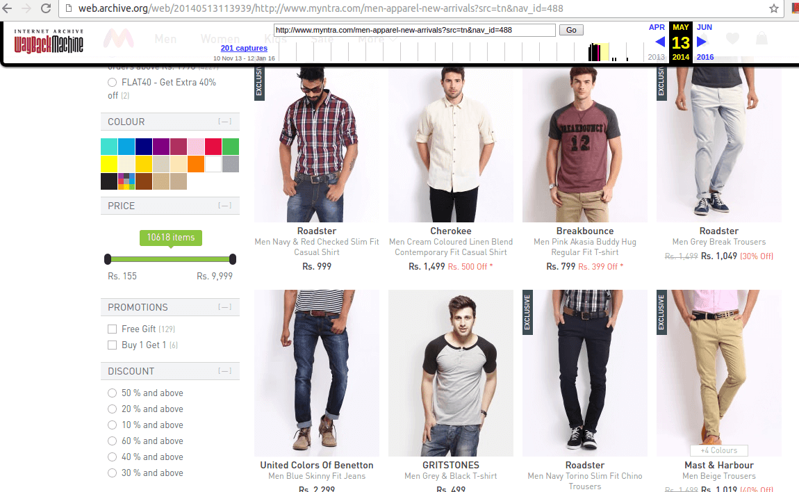
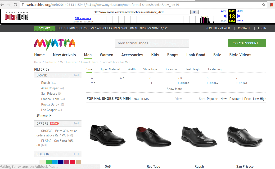
However, we felt the website looked more or less the same and offered a similar experience. We headed over to Wayback Machine to confirm our observation. Here are some screenshots of the old Vs. new website -
2014
2016
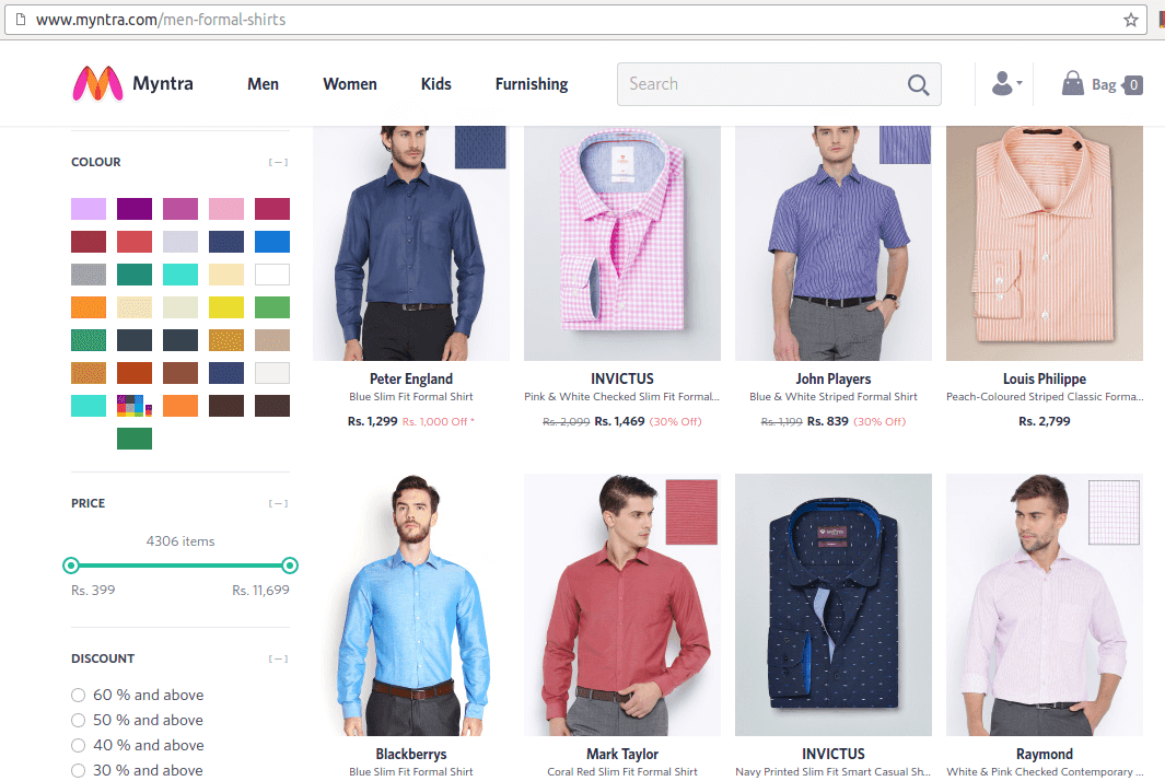
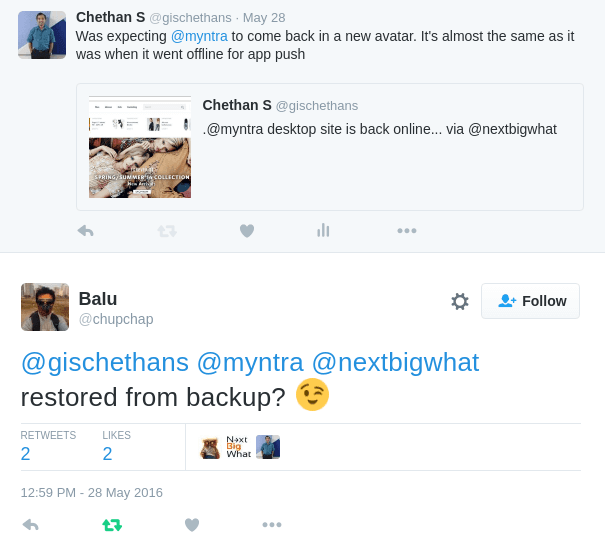
Balu had the best response for my observation -
The Changes
Some of the below-mentioned changes might have happened earlier and were visible to app users but as desktop users, we noticed them now -
- Myntra was known for having discounts all the time. The top black header which used to grab attention stating 30%, 40% off is now gone. Tighter margins to blame?
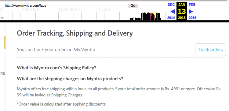
- Back in 2015, free shipping was available for orders above Rs. 499 but now it is for orders above Rs. 999
Did you hate it when Myntra went app only? In case you had stopped / reduced purchases from Myntra, now that Myntra's desktop website is back, do you plan to shop at Myntra?


