For years now, the web versions of Google products such as Gmail, Google Drive, Google Sheets etc. have the design unchanged. However, Google has finally decided to make a move and refresh the interface this year and the first product to get the refreshed interface was Gmail. Now, Google has announced that the web version of Google Drive will also receive a similar design overhaul starting today. Google confirmed that there's no change in functionality, but the company has made a range of visual tweaks to make the design match Google's latest material design principles. Furthermore, the new interface will be responsive and offers an efficient experience for Drive users.

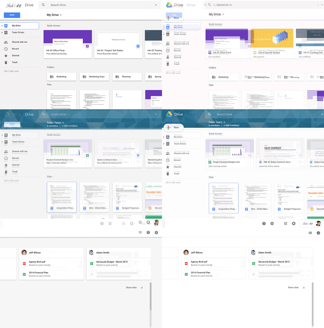
Google also listed wide-range changes included in the redesigned Google Drive for the web interface. Firstly, the logo on the top left has been changed to the Google Drive logo as you can see in the GIF below. Also, the custom company logo, if any will now be on the top right.
The Settings and Help Center icon has now been moved in-line with the search bar, and more importantly, the page background is now white coloured, not the earlier gray. The 'New' button has received a revamp too, which is now pretty much same the one we saw on the redesigned Gmail interface. Google also modified the font used for headers to give a refreshing feel.

Speaking about the rollout, Google in its blog post stated that they are launching it as a Rapid Release with the Scheduled Release coming in two weeks. The new design will be first available for all the Google Suite users. That said, there's no way you could enable the new design like on the Gmail as it's a complete server-side change. If you're lucky enough, you'll find the new interface on your Google Drive web version; If not, you've to wait for two weeks.


