Google surprised everyone by dropping the first Developer Preview of Android P today. It was rumoured that the company was planning for a mid-March release, but it's already here, and we managed to install it on our Pixel 2 device. The installation process took a while for us because of some OTA sideloading issues, which ultimately led us to manually install the firmware by unlocking the bootloader. But this post is not about the installation guide. Instead, we will discuss the features added by Google in this first Developer Preview of its next iteration of Android.
It's all about colours! The massive visual overhaul since Android 5.0 Lollipop
I have been following the Android world since the days of Android KitKat. How many would you agree with me if I say that Android Lollipop was the last major Android upgrade? The Android Lollipop was a massive Android upgrade ever, both in terms of features and visual overhaul. Since then, we haven't seen a major upgrade. I will call the Android Marshmallow, Nougat and Oreo as iterative upgrades, rather than a major upgrade, much like iOS 8, 9, 10 and 11 to the iOS 7.
However, Android P is a major upgrade since Android Lollipop, at least visually. Google, with the Android P, has introduced a colourful and redesigned quick settings, notification shade. It still resembles the same as Android Oreo, but those little colour additions to the quick settings make it appealing.

There are some additional things Google worked on to improve the quick settings. Right after pulling down the notification center, we'll be shown quick settings, and above those, there are small icons of settings which are currently in use. For example, if Wi-Fi is in use, then there will be a small Wi-Fi icon in black colour.
Dragging down will not give you the Settings icon anymore as it's completely moved to the quick settings menu. And the carrier information can only be accessed via the quick settings menu itself.
Google even updated the notification bubble, which now has a rounded look. Remember the Google Reply app which recently got leaked? The same feature is now integrated into the system of Android P and allows users to send smart replies, but limited to only a few apps.

You can still reply to a chat notification by pressing the reply button beside the notification, however, there's a change here as Google displays the entire chat unless you close it manually. Meaning, you can read the entire conversation right from the notification area itself, rather than opening the app. Nevertheless, do make a note that the conversation is visible only from the arrived message.
Settings app is now colourful than ever!
Moving on, we have the redesigned Settings app- a much-needed one too. The shape of the search bar on top of the Settings app is changed, and Google is keeping most of the features inside the sub-menus itself, as we have seen with the Android Oreo. As I stated, Google has added a coloured icon to every menu in the Settings app, which just looks gorgeous and way better than the stale colours we saw on the Android Oreo.

The About Phone menu is completely redesigned, and there's a small animation to every menu in the Settings app.
Low battery mode gets a small treatment
These are the visual changes in the Android P. Of course, Google has spent a lot of time for several minor changes. The low-battery mode is slightly changed now as it doesn't display that ugly red bar on the top of status bar. The functionality of the mode remains the same though. It still disables the vibrator in the smartphone and reduces background synchronisation to save the battery life.

Modified power button menu and volume menu
Another change which will be visible right away is the presence of screenshot option in the power menu. And the volume control menu is now placed vertically, along with a button to quickly mute or vibrate the device.

Pixel launcher and Ambient Display tweaks
Google also made some subtle changes to Pixel launcher as the Google search widget now has a microphone button. Also, Ambient Display now shows battery percentage at the bottom, a much-requested feature though.
Mark Up Tool for editing screenshots
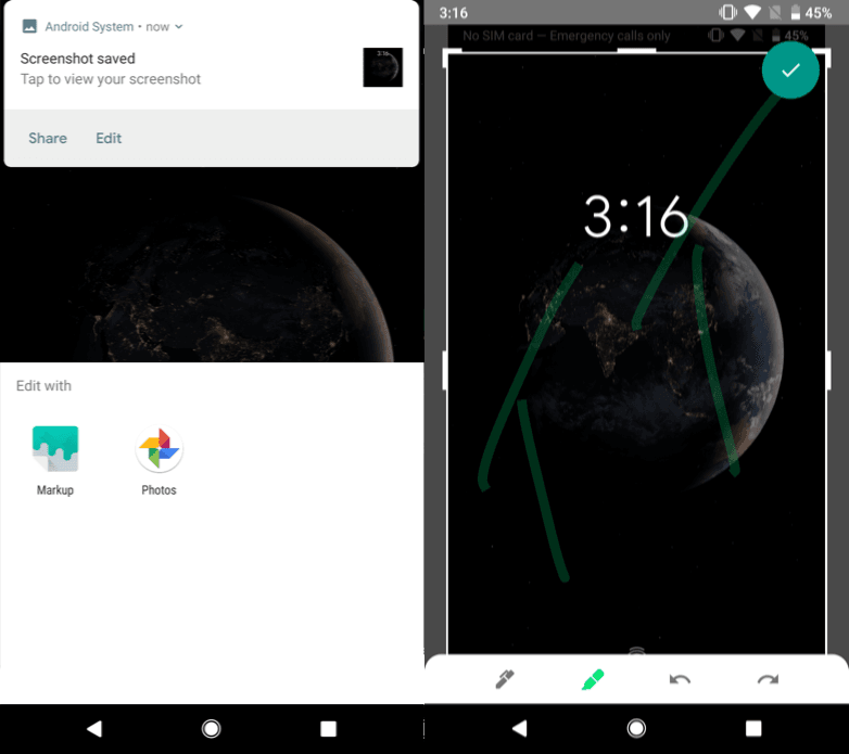
Google has included a new Mark Up tool inside the DP1 of Android P, which allows a user to edit the screenshots captured. For now, the functionality is pretty limited as you crop a screenshot or draw something on the image.
Android P officially supports display notch
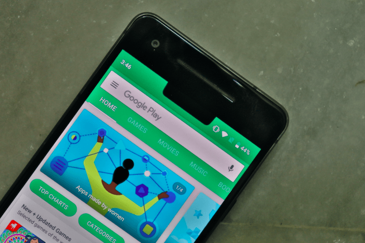
Yes, it's official now. Google has included a 'Device theme' feature, which offers four options- Narrow display cutout, Pixel, Tall display cutout and wide display cutout. These cutouts are basically meant as different sizes of notches. This essentially doesn't mean that the Pixel 3 will come with a notch as there' still a Pixel theme though.
Colourful Easter Egg
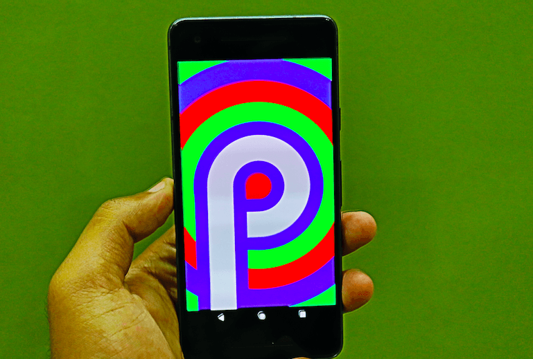
The Easter Egg of Android P is colourful. Period. I guess this is the best easter egg in the iteration of Android and the colour changes is trippy.
So far, we have found out these changes in the Android P Developer Preview 1. There are a lot of things which has changed under the hood, which we will discuss later. We will keep you posted if we find something new in the first Developer Preview 1.
The first developer preview of Android P is available for Google Pixel, Pixel XL, Pixel 2 and Pixel 2 XL. As you might have guessed it already, Google seems to have ended the support for Nexus 5X, Nexus 6P and Pixel C tablet.


